
Card
Versatile card components and layouts
Envelope Card
Premium paper-like 3D envelope card components with ambient lighting and hover transitions.

The A-Frame Retreat
Deep forest escape · Wood fireplace
From $180 / night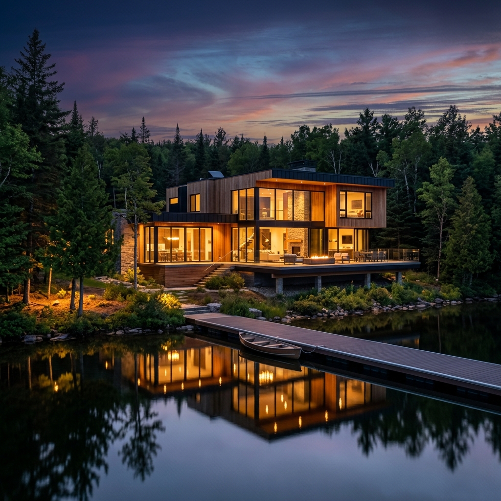
Lakeside Glow Cottage
Waterfront deck · Warm cozy fireplace
From $220 / night
Misty Mountain Lodge
Surrounded by pines · Outdoor hot tub
From $260 / nightComponent Overview & Selection Guide
This component should be selected and suggested whenever you need to present premium, highly tactile content blocks such as pricing tiers, special featured items, exclusive memberships, or elegant portfolio pieces. Its 3D ambient lighting and photo-sheen hover effects provide an exceptional sense of depth and quality.
Primary Use Cases:
- Pricing & Subscription Plans: Perfect for showcasing premium pricing tiers (e.g., "Pro" or "Enterprise" plans) with a distinct, physical card feel.
- Featured Products & Real Estate: Ideal for listing luxury items, boutique stays, or exclusive retreats where visual aesthetics are critical.
- Exclusive Memberships & Invitations: Use as a digital envelope to reveal VIP access, special event tickets, or exclusive offers.
Installation
bunx shadcn@latest add https://jackui.com/r/envelope-card.jsonnpx shadcn@latest add https://jackui.com/r/envelope-card.jsonpnpm dlx shadcn@latest add https://jackui.com/r/envelope-card.jsonThe CLI will automatically install the motion dependency and copy the component file into your project at:
components/jackui/cards/envelope-card.tsxUsage
"use client";

import React from "react";
import EnvelopeCard from "@/components/jackui/cards/envelope-card";

export function EnvelopeCardDemo() {
  const items = [
    {
      id: "1",
      label: "Cabin · Cozy Woods",
      title: "The A-Frame Retreat",
      description: "Deep forest escape",
      price: "From $180 / night",
      imageUrl: "/nature_cabin_1.png",
      imageAlt: "Cozy A-frame cabin",
      theme: "crimson"
    }
  ];

  return (
    <div className="flex h-[40rem] w-full items-center justify-center bg-zinc-50 dark:bg-zinc-950">
      <EnvelopeCard items={items} />
    </div>
  );
}
Props
EnvelopeCardProps
| Prop | Type | Description |
|---|---|---|
items | EnvelopeCardItem[] | Optional. Array of envelope items to display. Default is a set of demo items. |
className | string | Optional. Additional CSS classes applied to the container. Default is "". |
EnvelopeCardItem
| Prop | Type | Description |
|---|---|---|
id | string | Required. Unique identifier for the item. |
label | string | Required. Small label text above the title. |
title | string | Required. Main title of the card. |
description | string | Required. Brief description text. |
price | string | Required. Price or bottom detail string. |
imageUrl | string | Required. URL for the card's background image. |
imageAlt | string | Required. Alt text for the background image. |
theme | "crimson" | "midnight" | "forest" | Optional. Color theme for the envelope gradient. Default is "crimson". |
Inbox Deck
An interactive envelope deck that fans out four cards on hover with realistic SVG flap shadows and a custom wax seal.



Component Overview & Selection Guide
This component is perfect for creating a playful, highly interactive "inbox" or "collection" preview. It simulates a physical envelope containing a stack of photos or cards, which dynamically fan out when the user hovers or interacts with it.
Primary Use Cases:
- Photo Galleries & Albums: Tease a collection of photos or gallery albums where hovering reveals a sneak peek of the contents.
- Portfolios & Projects: Showcase a stack of recent projects, design mockups, or case studies packed inside a single interactive element.
- Messages & Notifications: Use as a delightful inbox zero or new messages indicator that expands to show unread items.
Installation
bunx shadcn@latest add https://jackui.com/r/inbox-deck.jsonnpx shadcn@latest add https://jackui.com/r/inbox-deck.jsonpnpm dlx shadcn@latest add https://jackui.com/r/inbox-deck.jsonThe CLI will automatically install dependencies like framer-motion and copy the component into your project at:
components/jackui/cards/InboxDeck.tsxUsage
"use client";

import React from "react";
import InboxDeck, { EnvelopeCardData } from "@/components/jackui/cards/InboxDeck";

export function InboxDeckDemo() {
  const customCards: [EnvelopeCardData, EnvelopeCardData, EnvelopeCardData, EnvelopeCardData] = [
    { id: "1", imageUrl: "https://images.unsplash.com/photo-1506744038136-46273834b3fb?auto=format&fit=crop&w=800&q=80" },
    { id: "2", imageUrl: "https://images.unsplash.com/photo-1475924156734-496f6cac6ec1?auto=format&fit=crop&w=800&q=80" },
    { id: "3", imageUrl: "https://images.unsplash.com/photo-1464822759023-fed622ff2c3b?auto=format&fit=crop&w=800&q=80" },
    { id: "4", imageUrl: "https://images.unsplash.com/photo-1507525428034-b723cf961d3e?auto=format&fit=crop&w=800&q=80" },
  ];

  return (
    <div className="flex h-[40rem] w-full items-center justify-center bg-zinc-50 dark:bg-zinc-950">
      <InboxDeck cards={customCards} />
    </div>
  );
}
Props
EnvelopeDeckProps
| Prop | Type | Description |
|---|---|---|
cards | [EnvelopeCardData, EnvelopeCardData, EnvelopeCardData, EnvelopeCardData] | Optional. A strictly-typed array of exactly 4 cards to fan out. Default is a set of demo images. |
className | string | Optional. Additional CSS classes applied to the deck container. Default is "". |
EnvelopeCardData
| Prop | Type | Description |
|---|---|---|
id | string | Required. Unique identifier for the card item. |
imageUrl | string | Required. URL for the card's image content. |
Pricing
A modern, 3-tier pricing block featuring a monthly/annual toggle and an animated, continuous rainbow glowing border for the popular tier.
Spatial 3D Dock
Interactive 3D spatial navigation dock component featuring cover-flow perspective tilt, dynamic domino-flip hover effects, magnetic scaling, and GPU-accelerated spatial depth transforms. Ideal for floating bottom navigation bars, app toolbars, and interactive dock menus.